
“The result has been that the British planting palette is no longer based on the colour theory of Jekyll and the Arts and Crafts movement; indeed, it’s no longer a ‘palette’ at all, since colour is deemed of secondary importance to form.”
(Tim Richardson, first published in Country Life, 2011)

Scampston Hall In Yorkshire – the work of Piet Oudolf
Mark is re-reading the collection of Richardson’s writings in ‘You Should Have Been Here Last Week’. I am waiting in line. It warrants another reading. It was the rather sweeping claim that colour is now playing second fiddle in British gardens that had Mark and I pausing to think. When you read on, I think his use of the word ‘form’ is misleading. He is not talking about hard landscaping (all the permanent structures, paving and infrastructure of a garden that gives it year round form). He is talking about planting styles – the way the plants are grouped and the huge changes that have come into the contemporary gardens. The rhythm of the planting is a better description, because it is about the move from static picture gardening (often best admired in a photograph) to the more dynamic, immersive experience of moving through a garden. It is a very different experience and has certainly been a revelation to us on our last three garden visiting trips to the UK.

Olympic Park in London
I digress. I was going to take issue with his suggestion that colour is no longer a driving factor in such plantings. On the contrary, most of the contemporary plantings we have walked amongst use bold, vibrant colour but in a different way. The Victorians gave us floral clocks and garish bedding plants but they were all ankle-height, more or less. The Edwardians moved into the refined ‘pastelle’ era that still endures in many New Zealand gardens today. Then came all that colour toning and use of white that still remains de rigueur, still mostly pastel. Good taste, many think. The vibrancy of the masses of strong colour evident in many of the more modern plantings is like a statement of a new age. Big, bold, colourful and no longer vulgar.
 I got to thinking about this because the Resene magazine ‘habitat’ (the lower case indicates modernity, darls) turned up in my letter box. Resene is a leading paint brand in this country. And I burst out laughing at the guide to ‘your next big colour trends’. This is because we are renovating our two main living rooms so I know that the greying of New Zealand has continued unabated, along with white or off-white walls. And black kitchens now, I notice. We have no white and no grey in our house and ended up with a choice of exactly one green carpet for these rooms surrounded by garden.
I give you edited highlights from the Resene mag:
“As communities galvanise over social and political movements you can see design trends going bolder, with true reds, or stormy blues and dark brooding tones.” Leaving aside my pedantic worries about the ad hoc use of commas, I wondered where these galvanising communities are, along with the bold colours which seem to be singularly missing in action.
But the article goes on: “Warmer colours are generally on the rise, … Such colours carry the promise of global exploration and porous borders….” Oh really? Who writes this stuff? Did they cut their teeth writing real estate copy? Given my penchant for dusky pink in other areas of the house, I was a bit worried about telling Mark that this is now very dated, so dated in fact that it is “millennial pink” and – wait for this – “a colour borne out of the global movement toward gender fluidity”. I tell you, that had simply never occurred to me.
So what does the article tell me about green, given my decision to swap out the blues for greens in our dining and living rooms? “Green has been emerging in homes during the past few years as our eco-consciousness grows and yearning to connect with nature via biophilic design.”
I had to google ‘biophilic design’, I did. And that was a revelation. There are many listings on the topic and from my most perfunctory look, it appears to be a marriage of Rudolf Steiner and biodynamics with inner city, apartment living – philosophically speaking. So now we know.

 All this return to colour thinking was also sparked by wandering through our park and looking at the deciduous azaleas with their OTT, unabashed vibrancy – vulgarity, some may think. And I remembered the man who came around the garden when we were still open and asked ‘what is the big orange rhododendron behind the house’. We have garden borders behind the house but I couldn’t think of a plant like that there so I suggested he go and pick a flower and bring it to us. Well, not only did it transpire that ‘behind the house’ meant the spacious park area but he returned bearing an entire head of an orange azalea that he had snapped off, not the single bloom. After all that, we did not have it available for him to buy.
 In self-defence, I say that our bold azaleas are mostly interspersed throughout the park, so surrounded by acres of verdant green rather than being planted en masse to dazzle the eyes. And they have been there quite a long time so endured the changing fashions of colour down the decades.

 I was slightly alarmed by an inadvertent colour combination in my new borders. I picked a flower of each to show the colours more clearly. I am pretty sure I thought the bearded irises were all yellow when I planted them but 80% are purple. While the colour is sparse in these early stages of planting, I am thinking ahead to when each forms a large wodge of colour.
 Take the blue-purple out to keep the ramped-up colour.
 Or take the yellow out and it looks very different, toning it down considerably. I am marking the ones flowering yellow. I think I prefer the second version but it all comes down to personal taste in the end.
 Trentham Gardens shows that it can get pretty close to being all things to all people. Even on a cool, grey Monday afternoon, the place was humming. Mark and I have a running gag about the “sense of arrival” at gardens. One day I will explain the origin of our cynicism about this but we worked out long ago that the greatest “sense of arrival” is a full carpark. And on this Monday afternoon, I photographed our rental car so we could find it again later. As an aside, you can have any colour of car you like in Britain, as long as it is black or grey. And one grey rental car looks pretty much like 80% of the other cars.


 Those plans included extensive gardens, monkeys, a luxury hotel on the site of the


 Postscript *I do not want to overstate the evening concerts. In fact I looked at the programme boards and wondered if it was just the one contracted band in different guises. The amphitheatre stage was but modest. Maybe they are catering to a specific local demographic, this year at least? On our last visit we saw Hatfield House in London preparing for a major concert. U2? Or was it UB40? I have waited three years to use my photo of the portaloos at Hatfield. Trentham is not trying that scale of concert at this stage but give them time. I am sure they will be looking at it for feasibility and profitability.

 1) Confining planting to geometric blocks (Mondrian-style perhaps, for students of art), has been evident in show gardens in recent years but has now become mainstream. This is a new planting on Hampstead Heath, done by the public authorities. The sharp lines will blur over time. It is a shame about the buxus blight that is already evident. A different clipped shrub may have been a better choice.
 2) Piet Oudolf’s rivers of colour in the modern borders at Wisley have been controversial since they were planted in 2000, but we think they are glorious. They also take much less labour to maintain than the traditional twin herbaceous borders. Each ribbon of colour has about four different plants in it and the colours will change through the season. You need to be able to look up or look down on this type of planting (or both). Viewed on the flat, you would not see the diagonal effect.
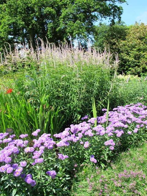 3) Less ambitious may be to snake a river of one perennial through clumping plantings. In this case it is an erigeron daisy but I have already done it in my own garden with irises (the blue sibirican ones and also Higo iris). A river effect alters the dynamic of big, round clumps of plants or can give some visual unity to an otherwise disorganised planting.
 4) Big generous clumps of perennial plants, each standing in its own space, are one of the hallmarks of the New Perennials Style that has been widely adopted in modern UK and northern European gardens. This is a private garden, the work of British designer, Tom Stuart Smith. It takes a big area to carry out well. Each plant is occupying an area at least a metre across, sometimes more. Clipped shrubs act as punctuation points.
 5) The classic cottage garden mix and match style is harder to manage than it looks if you are determined to keep both a succession of flowers and good coverage – to avoid bare patches – throughout the warmer months. This is in a Dorset garden owned by a good gardener. In lesser hands, it can become a hodge podge with bare bits and small plants of potted colour added in an effort to fill in the gaps.
 6) The classic twin herbaceous borders adapted to a more personalised, private garden (in this case Gresgarth, near Lancaster) by breaking up the expanse into shorter sections using clipped hedging in battlement style and strategic topiary. In line with modern expectations, planting is now deliberately colour-toned and separate sections allow the colour palettes to be kept apart. The effect is deliberately refined.
 7) Grasses! Grasses! More grasses! And many meadows, let alone prairie plantings. No discussion about modern perennials is complete with referencing these major trends. These deserve attention in greater detail and are part of a bigger picture of focussing on more environmentally friendly approaches to gardening.