
“The result has been that the British planting palette is no longer based on the colour theory of Jekyll and the Arts and Crafts movement; indeed, it’s no longer a ‘palette’ at all, since colour is deemed of secondary importance to form.”
(Tim Richardson, first published in Country Life, 2011)

Scampston Hall In Yorkshire – the work of Piet Oudolf
Mark is re-reading the collection of Richardson’s writings in ‘You Should Have Been Here Last Week’. I am waiting in line. It warrants another reading. It was the rather sweeping claim that colour is now playing second fiddle in British gardens that had Mark and I pausing to think. When you read on, I think his use of the word ‘form’ is misleading. He is not talking about hard landscaping (all the permanent structures, paving and infrastructure of a garden that gives it year round form). He is talking about planting styles – the way the plants are grouped and the huge changes that have come into the contemporary gardens. The rhythm of the planting is a better description, because it is about the move from static picture gardening (often best admired in a photograph) to the more dynamic, immersive experience of moving through a garden. It is a very different experience and has certainly been a revelation to us on our last three garden visiting trips to the UK.

Olympic Park in London
I digress. I was going to take issue with his suggestion that colour is no longer a driving factor in such plantings. On the contrary, most of the contemporary plantings we have walked amongst use bold, vibrant colour but in a different way. The Victorians gave us floral clocks and garish bedding plants but they were all ankle-height, more or less. The Edwardians moved into the refined ‘pastelle’ era that still endures in many New Zealand gardens today. Then came all that colour toning and use of white that still remains de rigueur, still mostly pastel. Good taste, many think. The vibrancy of the masses of strong colour evident in many of the more modern plantings is like a statement of a new age. Big, bold, colourful and no longer vulgar.
 I got to thinking about this because the Resene magazine ‘habitat’ (the lower case indicates modernity, darls) turned up in my letter box. Resene is a leading paint brand in this country. And I burst out laughing at the guide to ‘your next big colour trends’. This is because we are renovating our two main living rooms so I know that the greying of New Zealand has continued unabated, along with white or off-white walls. And black kitchens now, I notice. We have no white and no grey in our house and ended up with a choice of exactly one green carpet for these rooms surrounded by garden.
I give you edited highlights from the Resene mag:
“As communities galvanise over social and political movements you can see design trends going bolder, with true reds, or stormy blues and dark brooding tones.” Leaving aside my pedantic worries about the ad hoc use of commas, I wondered where these galvanising communities are, along with the bold colours which seem to be singularly missing in action.
But the article goes on: “Warmer colours are generally on the rise, … Such colours carry the promise of global exploration and porous borders….” Oh really? Who writes this stuff? Did they cut their teeth writing real estate copy? Given my penchant for dusky pink in other areas of the house, I was a bit worried about telling Mark that this is now very dated, so dated in fact that it is “millennial pink” and – wait for this – “a colour borne out of the global movement toward gender fluidity”. I tell you, that had simply never occurred to me.
So what does the article tell me about green, given my decision to swap out the blues for greens in our dining and living rooms? “Green has been emerging in homes during the past few years as our eco-consciousness grows and yearning to connect with nature via biophilic design.”
I had to google ‘biophilic design’, I did. And that was a revelation. There are many listings on the topic and from my most perfunctory look, it appears to be a marriage of Rudolf Steiner and biodynamics with inner city, apartment living – philosophically speaking. So now we know.

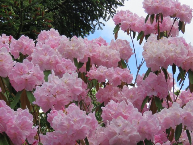
 All this return to colour thinking was also sparked by wandering through our park and looking at the deciduous azaleas with their OTT, unabashed vibrancy – vulgarity, some may think. And I remembered the man who came around the garden when we were still open and asked ‘what is the big orange rhododendron behind the house’. We have garden borders behind the house but I couldn’t think of a plant like that there so I suggested he go and pick a flower and bring it to us. Well, not only did it transpire that ‘behind the house’ meant the spacious park area but he returned bearing an entire head of an orange azalea that he had snapped off, not the single bloom. After all that, we did not have it available for him to buy.
 In self-defence, I say that our bold azaleas are mostly interspersed throughout the park, so surrounded by acres of verdant green rather than being planted en masse to dazzle the eyes. And they have been there quite a long time so endured the changing fashions of colour down the decades.

 I was slightly alarmed by an inadvertent colour combination in my new borders. I picked a flower of each to show the colours more clearly. I am pretty sure I thought the bearded irises were all yellow when I planted them but 80% are purple. While the colour is sparse in these early stages of planting, I am thinking ahead to when each forms a large wodge of colour.
 Take the blue-purple out to keep the ramped-up colour.
 Or take the yellow out and it looks very different, toning it down considerably. I am marking the ones flowering yellow. I think I prefer the second version but it all comes down to personal taste in the end.


 Down near one of the city beaches, I saw this very colourful front garden on a steep slope. I wrote a piece back in early 2013 about city

 Finally, it was back to the graveyard (aka Te Henui Cemetery) because Sydney-based daughter was with me and she expressed a desire to see it. It is so pretty, so vibrant, and so unexpected. It is part of the garden festival this week. I asked one of the volunteers yesterday how it was going with garden visitors. “They seem to like it,” she said, in a self-deprecating way. “They arrive with very low expectations since it is a cemetery, so it is not hard to please them.” It is better than that. Do visit, if you are in the area.


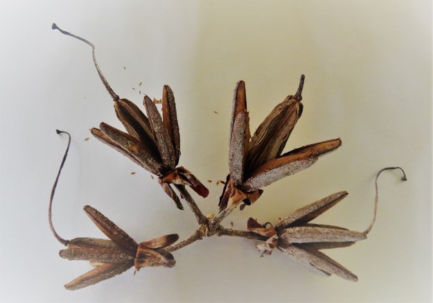

 Finally, this exhumed pile of wire and netting is a salutary comment on the longevity of synthetics. I found it when I was digging a hole in a bank to plant clivias. The netting must have been buried over four decades. It pre-dates Mark’s return to the property in 1980. His father did not believe in taking anything to the dump. While it can be ripped now, it is not decomposing. We are now trying to lead a life shunning as many plastics and synthetics as we can but there are decades of waste clocked up by pretty much each and every one of us, already NOT breaking down in the environment.


 I don’t have any photos of sand saucers but if you Google images, you will find a resurgence on Pinterest. Where else? For anyone with a deprived childhood, it involves filling a saucer with wet sand and sticking the flowers into that to anchor them. The scope for imagination is limited. One memorable year, a junior teacher at the school our children attended – a woman who was not one for expending unnecessary effort – decided sand saucers were ‘messy’ so they decreed Vaseline saucers instead. For this, the saucer is used face down and coated in Vaseline with flowers stuck to it. This was a travesty of an idea, I tell you. Not the same at all.


 I quite like watching English real estate programmes (Kirstie and Phil assisting escapes to the country come to mind). They have many more little country churches complete with old graveyards surplus to requirements than we have. It is too late for me – and the wrong country – but the idea of creating a home within a traditionally sombre setting and a garden with all the hard landscaping features already in situ sounds appealing. These places may be there to remember the dead, but it does not mean that they must be sombre, morbid and gloomy. Death and taxes may be two of life’s certainties, but there can be life and colour wrapping around death and softening its raw finality, even if the same can not be said for taxes.
 The one remaining mystery for me is why some families prefer to adorn their graves with fake flowers. It is a timely reminder, however, that some of these graves are intensely personal memorials with living descendants who choose to maintain the connection and to personalise the grave in their own way. It is just as well the volunteers are there to tend to the vast majority which would otherwise be largely forgotten and uncared for.
