

Red and yellow flower board

Red and yellow tulips in a massed bedding display at Floriade in Canberra
When I put my thinking cap on about garden colours, it was clear that a two-colour garden is much more flexible than trying for the monochromatic look. Technically, a two colour garden is three colours but we continue to regard green as colour neutral in a gardening situation. Truth be told, unless you are into massed bedding plants, the vast majority of gardens end up being predominantly green so whatever colours you add in – whether by way of flowers or coloured foliage – are highlights, not the dominant colour by mass.

Blue and yellow is a classic combination
A two-colour scheme gives so many more choices while allowing the streamlined look of restraint that some people favour. When I have played with flower boards, it is a lot more fun mixing and matching with two colours and the results are often more atmospheric. For a long time, I wanted to theme a garden on blue and yellow. It still remains one of my favourite colour combos and is one I have used on several occasions when it comes to interior decoration. It started when our eldest daughter chose a strong sunshine yellow for her bedroom and we teamed it with navy blue soft furnishings. In our current house, I chose a more subdued yellow – more like cornfield yellow teamed with French blue and I have never tired of that combination. In a garden, we can put together ALL the yellows and lemons with the whole range of blues. It is what I would call a classic combination.

Purple and orange for a tropical look

Purple and yellow with colour-toned visitors at Olympic Park in London
If you choose orange and purple, the look becomes very different – far more tropical and contemporary rather than the classic. It all comes down to personal colour preference in the end. I once contemplated the practicality of a garden in buff and pale blue – inspired by a gorgeous buff coloured rose. I wondered about using it with soft blues like the pretty nigella and the buff-brown grasses that seed down here. I realise in retrospect that my mental image did not incorporate green which would have altered the look entirely. Clearly the rose was already defoliated in my mind’s eye so that only the flowers were visible and I abandoned that idea altogether when I found that the rose was disease-prone and would need regular spraying to keep it looking anywhere near acceptable.
I recall a startling street scene in Rome, somewhere near the Vatican but I can’t find my photos of it. The buildings were all sandy gold in colour and the street trees were all burgundy (maybe copper beeches or one of the red-foliaged plum trees). It was very uniform – the buildings were all very similar and the trees were identical. There was no green. The combination of deep burgundy and sandy gold was strong and certainly had the wow factor.

Orange and bright pink on a traffic island in our local town of Waitara. Bedding plants give a massed display that are rarely seen in a home garden but can give ideas for colour combinations
Maybe look at bedding plant displays in public gardens and on traffic islands, not for the plants used, but to see the different colour combinations. Because if you are going to try the two-colour route, it is entirely personal taste as to which colours you like. There are no rules to this. Just pick a colour and move across the range of hues in that colour, rather than limiting yourself to just one shade of the colour. Gardens are never static so it is a more dynamic medium than interior design.


Hirst Cottage – the garden is a unified theme of white on green with red highlights (and black)
In New Plymouth, Judy Gopperth, opens her garden called Hirst Cottage for the annual garden festival at the beginning of November each year. Hers is one of the few places I have seen that has a totally disciplined approach to colour management in a smaller town garden. Basically, it is themed on red and white. Except it is more a case of theming on white and green (as she describes it herself) with red highlights and black as a background. The red appears mainly in small touches in the hard landscaping and the soft furnishing and it creates a bold contrast to the dominant white and green. It is a completely controlled use of colour which unites the outdoor space with the house (in her case, a very early historic cottage).
This style may appeal to people living in urban situations where outdoor space is very limited and is solely there as an extension of indoor living space. The designer look, I guess. It is unified, crisp and uncluttered. In theory, you could change the look relatively easily by swapping out all the red for another single colour.

Pink and yellow at Floriade in Canberra
The one colour combination that I personally dislike intensely is pink and yellow. I have seen it looking pretty in clear pastel pink and lemon in a tulip display in Eden Gardens in Auckland, but hideous in a display at Floriade in Canberra. It is so easy to get wrong. There are many murky shades of pink – pinks with brown or purple tones within them – which can look lovely in combination with other colours. But put them with hard yellows and I shudder. There are plenty of plants to choose from. I have seen many a murky pink with yellow variegated foliage which have managed to achieve the combination in a single plant. I am not at all keen the combination of a bright yellow kowhai and the cerise pink of a cercis that I drive by each spring in a nearby garden. Nor do I like bright yellow grasses combined with pale pink flowers. But that is entirely personal taste. If a carefully colour controlled garden is what you want and pink and yellow pleases your eye, go for it. Don’t let me put you off.
There are times in my life when I have tried using a hugely restricted colour palette but I always seem to add in another colour to give some visual oomph. Over time, it has become more a matter of deciding what colours to leave out – so a process of exclusion rather than starting with just a two or three colour palette. But that is a different approach altogether.

Blue and white at Auckland Regional Botanic Gardens
My final suggestion is that if you want to try a two-colour garden and you lack confidence, try any colour plus white. That is the safe option.

Pretty in pinks and white at Floriade
 I garden so I have a lot of thinking time. And it struck me this week that the reason why good summer gardens are a rare occurrence in this country is because most New Zealanders start a garden by planting out the trees and shrubs, then the hedgings and edgings. Herbaceous underplanting is more of an afterthought, not unlike adding cushions to a sofa. A filling in of remaining spaces.


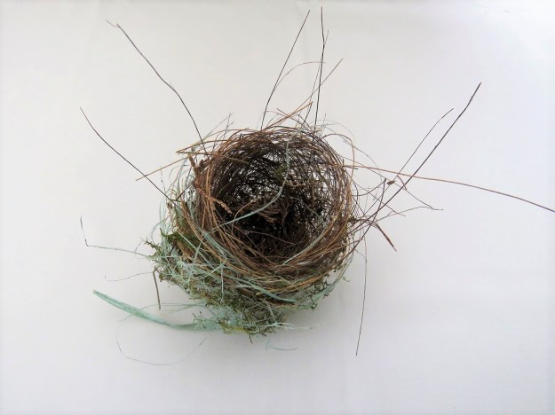


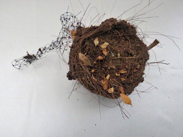
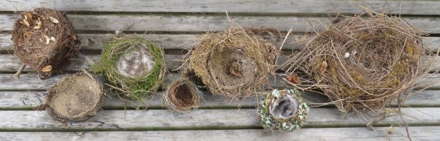


 In terms of unobtrusive tying, I have now gone to old fashioned jute string which is apparently still on the market though I have yet to find who is selling it. I shall go looking and stock up because it is one of those traditional products that can suddenly disappear. I have tried many tying options, including black twine (but it was synthetic), nursery tying tape (black plastic) and stockinette ties in muted hues. The jute twine is easy to use as long as you are tying loosely, so unobtrusive it is near invisible and it is a natural product. This means that when it comes to de-staking plants later in the season (I am currently staking some of the lilies), it doesn’t matter if the ties fall to the ground to gently decompose. That is my practical hint of the week. Find some jute twine. We have been horrified at the amount of plastic that has turned up in birds’ nests. Maybe they will find the jute twine instead.
 Finally, on the topic of green and white, can any knowledgeable gardener confirm with authority that this is an albuca and put a species name on it? Huge bulbs, as large as any I have seen, which like to sit half out of the ground and flower spikes up to a metre and half tall. The albuca family is a large one that I am having trouble disentangling, especially as we have thought for many years that this plant was in fact an ornithogalum. I am not sure where we got that idea from.
 I love Christmas. I love even more the lifetime of memories that come out once a year with the Christmas bric a brac stored in the Harry Potter cupboard beneath the stairs. Our little nativity scene may even pre-date Mark’s birth. It certainly pre-dates mass plastic because it is made from its precursor – bakelite which was not much used after the 1940s. I have to admit that Joseph used to have a teeny tiny lantern that hung from his hand and I can still recall my dismay as I vacuumed it up many years ago and then failed to find it in the cleaner bag.
 I enjoyed the wreath I made last Christmas in order to display the bakelite holy family. I know you can buy wreathes at shops like Spotlight but we live in the country so I improvise. In this case I retrieved a few grape vine prunings from where they had been thrown to decompose under a hedge. Because I use fresh flowers, my seasonal wreathes are but temporary affairs when compared to the tinsel numbers I see elsewhere, but their carbon footprint is minimal.

