The garden of many colours

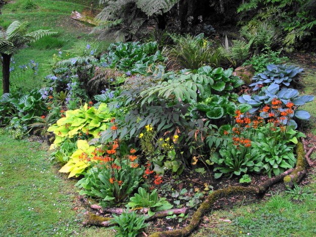
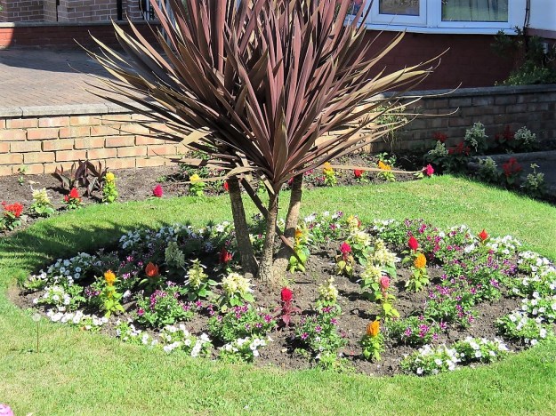
All the colours, bar pure red, in a cold, semi shade border in our park

Most of us garden with many colours. The advent of the strictly controlled and restricted colour palette is a recent phenomenon, though it has gained such supremacy in some circles that it is seen as the height of style.

Over the past weeks, Tony Murrell and I have been discussing garden colour schemes – incrementally – on our Radio Live Home and Garden Show sessions of a Sunday morning. We started with the white garden, progressed to other monochromatic themed gardens, then the bi-colour options  last week. This morning we wrapped up with the multi-coloured garden.

The bottom line is that anybody who has bought an existing garden will almost certainly have a multi coloured affair. And many of those who started off with a very purist and limited approach are likely to have fallen off the wagon and grown some plants which they love but which don’t adhere strictly to the original vision. In the end, it is a lot more interesting to work with a wider range of colours. Nature, after all, is random and does not play by arbitrary rules determined by humans. It is much easier to wield the iron hand of control over static interior design than it is in a dynamic garden.

A beautiful example of cottage garden in Dorset

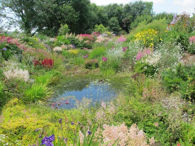
A colour coordinated meadow planting by Nigel Dunnett at Trentham Gardens

Cottage gardens and meadows have traditionally been a mix of all colours in together. It was interesting to see Nigel Dunnett’s meadow planting at Trentham Gardens near Stoke where he is creating colour-themed meadows in some areas. I follow Pictorial Meadows on social media and I see a lot of their seed mixes are now themed on colour so I guess there is a consumer demand for this. But if you are going to go down the mixed meadow path, there will be interlopers and competitor plants that move in and unless you are actively gardening the area all the time – which rather defeats the rationale of this particular garden genre – the purist colour theming is likely to be disrupted over time.

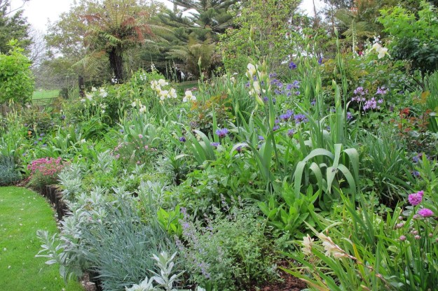
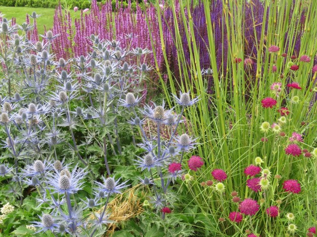
Predominantly pastel in Jennifer Horner’s garden, Puketarata, near Hawera

If you are nervous about throwing all colours in together, there are a few techniques you can use. The first is to go pastel. When you think about pastels, there are no clashing colours. Done well, you get a lovely soft scene of gentle colours – all very pastelle, if you know what I mean. The opposite is also true. If you want a super-vibrant look, cut out all the pastels and whites.

Lots of white and cream will tone down an otherwise very vibrant planting

Alternatively, you can tone down somewhat with plenty of white and cream flowering plants, as master gardener Keith Wiley has done in this scene. Lots of green foliage will also dilute any colour scheme.

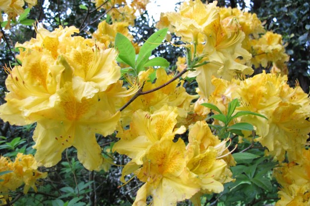
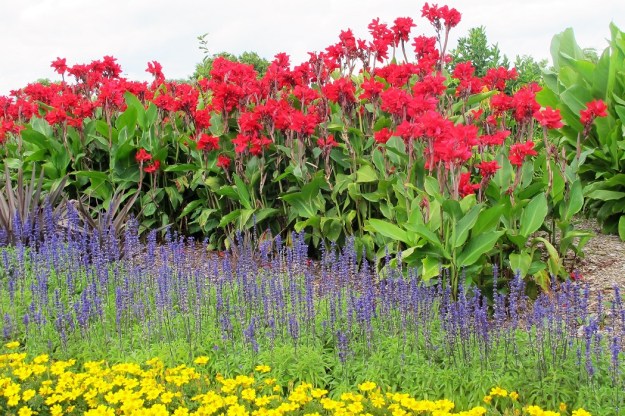
Pure yellow is a very dominant colour in a garden and will immediately draw most people’s eyes to it

A third approach is to cut out either yellow or orange. Cutting one but not both out is a bit like putting a soft filter over a photograph – it tones the whole scene down a few notches. Be cautious of how many bright yellows and acid yellows you use – maybe less than 10% of the plantings is all you need to lift the picture. More and the yellows start to dominate. I am referring to plants like some of the euphorbias, the unabashed bright yellow alstromeria and achillea, even the bold bright yellow rhododendrons like Saffron Queen or the uncompromising yellow azaleas. They all have their place but too many, and that is what your eye will be drawn to no matter what the colour mix is.

Not exactly strictly alternating, but I am sure you know what I mean

Colour all comes down to personal taste in the end. But I would suggest that only novices and newbies plant in alternating colours like a circus tent. This applies to bedding plants and also to more permanent shrubs. Too many people have asked me about planting alternating red and white camellias as a hedge. Best not, in my view, but feel free to disagree.

In his early twenties, Mark spent many hours getting to terms with colour theory by studying the Impressionists. To this day, when we are looking at other people’s gardens and analysing planting schemes, he will pull out the colour theory. If you want to get a better understanding of how colour works, there is a whole lot more in terms of both the juxtaposition and quantity of different colours. I work instinctively but Mark is very good on coming up with what shade or colour will lift a small scene that is lacking visual impact.

Maybe analyse the relative proportions of the colours used in showy plantings

If you come across a garden that really, seriously impresses you with its use of colour, maybe take some time to stand and look and analyse. There will be transferable lessons you can take away from working out the proportions of the colours used. Which colours stand out? What proportion of the total is each colour (roughly – 30% blue or is it closer to 50%?) What is planted adjacent to that colour that makes it so distinctive? Is it a colour on the opposite side of the colour wheel and is it also used just as a highlight or in equal quantities? You have to be quite keen to do this sort of thing but I am assuming that many who read my blog also like the idea of upping their own skills’ level. Developing a better understanding of how colour is being used has increased my appreciation of the large scale plantings Dutch designer, Piet Oudolf, is doing.

Destined to be dominated by pure blues a few weeks later – Keith Wiley’s naturalistic Devon garden

The ultimate skill, in my book, is the ability to change the dominant colour scheme of a garden as the seasons progress. I have only been strongly aware of it in two gardens I have seen. The first was the upper area in Keith Wiley’s “Wildside” in Devon. We looked at it in early to mid-summer when the dominant colours were oranges, yellows and tawny shades with some judicious use of cerise and pink but we could see what was soon going to come into bloom and the whole scene was destined to be dominated by blue a few weeks later. We would have gone back to see but we weren’t in the UK for long enough.

The second example I have mentioned before – Nigel Dunnett’s garden at the Barbican in London. Again, we were looking in early to mid-summer when the dominant colours were soft yellows and tawny apricot shades with a touch or three of purple. You could have knocked me down with a feather when I saw a photo of the same garden in autumn and it was spectacularly white. We are not talking changing bedding plants like they used to at Versailles. These gardens have permanent plantings executed with such skill that the colour schemes change with the seasons. This is a new pinnacle of gardening skill in my book.

Gone by lunchtime.

There has only ever been one significant flowering

Sometimes a tree just has to go. This flowering cherry has been sitting under a death sentence for several years. Mark planted it maybe 25 years ago and while it was quite a good shape, it rarely flowered and just grew larger, casting shade over other plants that were working harder for their continued existence. It will have been a named variety but we have long since lost the name.

“I am going to cut that cherry out,” said Mark about four years ago. It was as if the tree heard him and it confounded us by suddenly producing its best ever display of 2015. But 2016 and 2017 came and it was resting on its laurels of one decent enough performance, returning to its usual pattern of just a few scattered blooms.

One of the most useful skills Mark learned in his twenties was how to use a chainsaw safely. Possibly even more importantly, he learned the limits of his skills with the chainsaw and when it is necessary to pay for outside specialists to come in and handle a tricky situation. This tree represented no such problem. He dropped it efficiently and our Lloyd moved in to do the clean-up. Any branches too thick to be fed through the mulcher were sawn into short lengths and moved to the firewood shed. We get through prodigious amounts of firewood in winter, all of it harvested off the property. The leafage and small branches were mulched on the spot.

It was, as we say in New Zealand parlance, gone by lunchtime. Literally so, in this case.

I am not sure how people manage big gardens when they can’t do their own basic chainsaw work and manage the clean-up. Expensively, I guess.

Pretty enough flowers. Once. In 2015.

The two colour garden (plus green)

Red and yellow flower board

Red and yellow tulips in a massed bedding display at Floriade in Canberra

When I put my thinking cap on about garden colours, it was clear that a two-colour garden is much more flexible than trying for the monochromatic look. Technically, a two colour garden is  three colours but we continue to regard green as colour neutral in a gardening situation. Truth be told, unless you are into massed bedding plants, the vast majority of gardens end up being predominantly green so whatever colours you add in – whether by way of flowers or coloured foliage – are highlights, not the dominant colour by mass.

Blue and yellow is a classic combination

A two-colour scheme gives so many more choices while allowing the streamlined look of restraint that some people favour. When I have played with flower boards, it is a lot more fun mixing and matching with two colours and the results are often more atmospheric. For a long time, I wanted to theme a garden on blue and yellow. It still remains one of my favourite colour combos and is one I have used on several occasions when it comes to interior decoration. It started when our eldest daughter chose a strong sunshine yellow for her bedroom and we teamed it with navy blue soft furnishings. In our current house, I chose a more subdued yellow – more like cornfield yellow teamed with French blue and I have never tired of that combination. In a garden, we can put together ALL the yellows and lemons with the whole range of blues. It is what I would call a classic combination.

Purple and orange for a tropical look

Purple and yellow with colour-toned visitors at Olympic Park in London

If you choose orange and purple, the look becomes very different – far more tropical and contemporary rather than the classic. It all comes down to personal colour preference in the end. I once contemplated the practicality of a garden in buff and pale blue – inspired by a gorgeous buff coloured rose. I wondered about using it with soft blues like the pretty nigella and the buff-brown grasses that seed down here. I realise in retrospect that my mental image did not incorporate green which would have altered the look entirely. Clearly the rose was already defoliated in my mind’s eye so that only the flowers were visible and I abandoned that idea altogether when I found that the rose was disease-prone and would need regular spraying to keep it looking anywhere near acceptable.

I recall a startling street scene in Rome, somewhere near the Vatican but I can’t find my photos of it. The buildings were all sandy gold in colour and the street trees were all burgundy (maybe copper beeches or one of the red-foliaged plum trees). It was very uniform – the buildings were all very similar and the trees were identical. There was no green. The combination of deep burgundy and sandy gold was strong and certainly had the wow factor.

Orange and bright pink on a traffic island in our local town of Waitara. Bedding plants give a massed display that are rarely seen in a home garden but can give ideas for colour combinations

Maybe look at bedding plant displays in public gardens and on traffic islands, not for the plants used, but to see the different colour combinations. Because if you are going to try the two-colour route, it is entirely personal taste as to which colours you like. There are no rules to this. Just pick a colour and move across the range of hues in that colour, rather than limiting yourself to just one shade of the colour. Gardens are never static so it is a more dynamic medium than interior design.

Hirst Cottage – the garden is a unified theme of white on green with red highlights (and black)

In New Plymouth, Judy Gopperth, opens her garden called Hirst Cottage for the annual garden festival at the beginning of November each year. Hers is one of the few places I have seen that has a totally disciplined approach to colour management in a smaller town garden. Basically, it is themed on red and white. Except it is more a case of theming on white and green (as she describes it herself) with red highlights and black as a background. The red appears mainly in small touches in the hard landscaping and the soft furnishing and it creates a bold contrast to the dominant white and green. It is a completely controlled use of colour which unites the outdoor space with the house (in her case, a very early historic cottage).

This style may appeal to people living in urban situations where outdoor space is very limited and is solely there as an extension of indoor living space. The designer look, I guess. It is unified, crisp and uncluttered. In theory, you could change the look relatively easily by swapping out all the red for another single colour.

Pink and yellow at Floriade in Canberra

The one colour combination that I personally dislike intensely is pink and yellow. I have seen it looking pretty in clear pastel pink and lemon in a tulip display in Eden Gardens in Auckland, but hideous in a display at Floriade in Canberra. It is so easy to get wrong. There are many murky shades of pink – pinks with brown or purple tones within them – which can look lovely in combination with other colours. But put them with hard yellows and I shudder. There are plenty of plants to choose from. I have seen many a murky pink with yellow variegated foliage which have managed to achieve the combination in a single plant. I am not at all keen the combination of a bright yellow kowhai and the cerise pink of a cercis that I drive by each spring in a nearby garden. Nor do I like bright yellow grasses combined with pale pink flowers. But that is entirely personal taste. If a carefully colour controlled garden is what you want and pink and yellow pleases your eye, go for it. Don’t let me put you off.

There are times in my life when I have tried using a hugely restricted colour palette but I always seem to add in another colour to give some visual oomph. Over time, it has become more a matter of deciding what colours to leave out – so a process of exclusion rather than starting with just a two or three colour palette. But that is a different approach altogether.

Blue and white at Auckland Regional Botanic Gardens

My final suggestion is that if you want to try a two-colour garden and you lack confidence, try any colour plus white. That is the safe option.

Pretty in pinks and white at Floriade

Colour themes for gardens – the single colour choice

The primary colours, planted in stripes at Auckland Botanic Gardens

We are still talking colour theory at great length here. In great detail. In part this is driven by the start of the new year of gardening conversation with Tony Murrell on Radio Live’s Home and Garden Show. Tune in around 7.45am on Sunday if you want to listen live. Both Tony and I like to clarify our thoughts before we go on air and for me, that often means extended conversations with Mark, whom I have been known to call my in-house advisor or expert. This week’s conversations have been around the relatively modern idea of gardens themed on a single colour.

If you think of colours, basically a monochromatic garden is either reds, yellows or blues, whites or maybe green or black. What they all have in common is that green is regarded as colour neutral in a tightly colour-controlled garden. So whichever colour you choose, it is plus green. White, however, is not colour neutral in a colour-themed garden.

I have nothing more to say about white gardens that I have not said already. Except to reiterate that the most effective white gardens that I have seen are comprised of heavy flowering white perennials, sometimes mixed with annuals or biennials – so summer gardens at their peak. For a list of previous posts on white gardens, skip to the end.

The ‘black’ garden in the village of Giverny. Need I say more?

Black gardens? Way better in theory than in practice and even then it will still be a novelty garden (you should be able to hear the disdain in my voice). I have only ever seen one and that was a public planting in the village of Giverny. It was underwhelming. I wonder if they just didn’t have the black ophiopogon (mondo grass) because it was all black pansies, dark ajuga and dark foliaged shrubs. Besides the fact that it seems extremely unlikely that black ever lifted anybody’s spirits or brought joy to their day, most plants that are described as black are in fact very deep burgundy. Leave it at the theory stage, is my advice.

I recently read an opinion that it is easier to manage a red garden than either blue or yellow. I beg to differ. And I think that comes back to the colour wheel and the role of white.

If you do a blue garden, the blues on the yellow side of the spectrum will be green-toned and therefore fit into the blue and green colour range. Those closer to red will throw to purple which sits perfectly happily alongside the blue and green tones. Add some white and you get pastel shades – pale blues, lilacs and lavenders and they all sit harmoniously in that blue colour palette.

The blue border at Sissingurst some years ago

I have seen two blue borders. The first was at Sissinghurst where we liked it much more than the famous white garden. The second was at Parham House in Sussex and it had been freshly renovated and was lovely. I am of the view that you can never have too much blue in a garden but that is personal taste.

The blue and yellow borders at Parham House

A similar scenario sits with a yellow garden. Head to the blue side and it is in the green shades. Head to the red side and it introduces orange. Add white and it is simply a paler hue of the same colour. I have only seen one example of an all yellow garden which may be a reflection on the unfashionable status of yellow and orange at this time in history. It was okay. Not stunning but fine and done well at Parham House again.

A random sampling of red foliage and blooms

Red is different. Pure reds are rare. Most lean either to the blue side which gives the purple and burgundy hues or to yellow which gives orange. Add white and you get a totally different colour – pink. There is no way I can see pinks as ‘pale red’. Then there are the many reds that are really closer to brown. I am not a fan of brown flowers, personally.

The red borders at Hidcote Manor Garden

I have seen two red borders – the classic red border at Hidcote and Alan Trott’s red border at his garden near Ashburton. Both were mixed borders and red foliaged shrubs mostly lean to the burgundy shades. That dominance of burgundy, even with splashes of scarlet, can seem quite sombre to my eyes. It comes down to taste.

Similarly, all green gardens can seem a bit gloomy to me, but I am writing this on a grey, rainy day. I can’t complain because we need the rain. Our rain deficit this summer is such that we are still an official drought area, but when I look out the window, the green does not look restful so much as sombre. To me, it is bold colour that lifts such scenes.

I am not convinced that it is as easy as some folks think to plant a monochromatic garden. At least not one of a high standard horticulturally and visually. I think it is easier to go to a two-colour garden (+ green, of course) but more of that next time. However, should you still hanker for a single coloured garden, I have one bit advice gleaned from looking at gardens created by some excellent horticulturists and skilled gardeners. Don’t be too slavish in your dedication to a single colour. Sometimes a flash of another colour can lift the whole scene. A splash of bright pink in a blue border maybe. Or a spire of blue blooms in a yellow garden. How  about the bright orange bloom of a canna lily with burgundy foliage in a red border?

Earlier posts on white gardens:

White gardens for the new age

Shades of white in the world of flower gardens 

White frou frou

The perils of the monochromatic colour scheme in gardening 


More than fifty shades of grey

I find it difficult to believe that flat planes of grey ever lift anybody’s spirits

I have been looking at carpets and truly, there is an endless choice as long as you want grey. Real estate grey, somebody commented when I posted my piece about colour in southern Italy. We had this idealistic thought that we would only buy wool which gave a choice of one blue and one green, given we have ruled out grey and shades of porridge and mud. For variation, I added another three samples of blue, green and muted aubergine in one of the new fibres which is, apparently, corn sugar mixed with synthetic but not actually nylon.

I have a theory now on New Zealand’s obsession with real estate grey both indoors and out. Colour fashions change over time. We know this. Some of us are old enough to remember the turquoise, ginger, oranges and purples of the late seventies. It was not the country’s subtlest moment in home décor. The eighties brought the muted shades of Paris pink, sage green, burgundy and dove grey.

So how did we get to plain grey?

We have always been an itinerant nation, moving house often. I found a story from 2008 which started, ‘More than a quarter of New Zealanders have moved at least once in the past two years, a survey reveals.’  It is likely to have accelerated since then, given the decline in our previously high home ownership rates. But at some point in the last decade or maybe longer, houses stopped being first and foremost homes and instead became investments. When a house becomes an investment, resale value assumes huge importance. And the real estate industry assures us that for a quick sale at maximum price, houses must be neutral and anonymous. Grey and white or maybe off-white with accent colour in sofa cushions.

Mark and I had a passing conversation about a real estate garden to accompany a real estate grey house. We didn’t get off colour theming and the thing about grey plants is that they are more often silver, with a lustrous sheen and qualities of light and shade that are missing from flat planes of utility grey. We figured that a real estate garden is simply the ultimate in tidy utilitarianism. In this day and age, it will probably be filled with dwarf nandinas.

For those of you who are curious, we are not happy with the quality of the 100% wool carpets on offer so will probably go with the muted aubergine option from corn sugar (or is it corn husk?). Mark feels that green carpet is better downstairs where it anchors the house to the green outdoors whereas he feels blue upstairs links to the sky. I was not so keen on the blue carpet and my heart lies with flat planes of muted colour. I have never forgotten our first trip to Northern Italy. It was a magnolia trip so early spring and the quality of light in the north was soft and almost ethereal. None of the harsh brightness further south. We visited an old church and inside was colour – faded colour but in hues of soft yellows, blues, pinks, greens and pale terracotta. I fell in love with that colour and in our home which is ‘1950 character’, as we say, that effect of faded or muted colour in sweeping expanses seems to fit us well.  So the upstairs of our house is on track to be in Northern Italian faded church colours of muted pinks, pastel blue greens, aubergine and soft yellow – all colour and texture with next to no pattern. But then we are not intending to sell our house so we do not feel that it will cost us money if we go for what we like and not resale grey and white. Our colour can just gently fade with us as we age.

When all is said and done, if you strip the colour from a monarch butterfly, all you are left with is an over-sized cabbage white with pretensions.